“Data Driven Nonprofits” by Steve MacLaughlin, Director of Blackbaud’s Target Analytics, came out this past month. It’s a good book. You should read it. It goes in depth on the concepts that data-driven nonprofits employ in their day to day activities.
But, if you are like me (really busy, wearing many hats at work, and constantly spinning different plates) you might not have the time. Fortunately, I can tell you 3 key takeaways from it that you can start implementing today.
“Data Driven Nonprofits” isn’t cutting-edge or revolutionary, but it does pose a compelling and frequently hearkened argument: nonprofits have untapped potential in their data. Steve does a nice job explaining the importance of digging into that data and why now is the time to start. This article will focus on doing that last part—getting started.
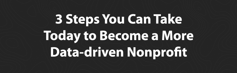
The 3 steps we will cover to get your nonprofit moving in the data-driven direction are:
- Focus on data health
- Start small
- Leverage innovative technologies
Focus on data health
Early on in his book, Steve makes a big distinction between the term “data hygiene” and his preferred name, “data health.” When you hear “hygiene” you think dentist. When you hear “health,” you think wellness.
Although the comparison isn’t apples to apples, it is close. And the distinction between the two terms can be undeniably meaningful when trying to change a culture of “data avoidance” within your organization.
Remember the 4 V’s when working with your data: Volume, Variety, Velocity and Veracity. Volume refers to the quantity of data available. Variety speaks to the diversity of the data. Velocity is the speed at which new data is collected. And most importantly, Veracity refers to the accuracy of your data.
Data health is data veracity. With accurate data your organization’s ability to be data-driven is unbounded. With inaccurate information even a Harvard educated data scientist won’t be able to offer much insightful analysis.
But, it is one thing to say, “keep your data healthy,” and another to actually do it. The first step towards housing more accurate data is proper data collection. There are dozens of CRM and donor management companies out there that strive to make this process as seamless as possible.
Here are a few resources that can help you make the right decision when purchasing a donor management software:
- NeonCRM’s Guide to Nonprofit Donor Databases
- Capterra’s Top Donation Management Software Products
- NTEN’s Consumer Guide to Donor Management Systems (skip to pages 20-31)
The technology is only half of the equation, though. The next piece is making the conscious effort to leverage that technology. Investing in a CRM and using it to its full potential is step 1 in your journey to achieving proper data health and more data-driven fundraising.
Start small
Do you have a lot of memories from grade school? Chances are that you don’t. But if you do, one of your fondest might come from math class. Why, because math is hard.
When you learn mathematics concepts you start small. A grade schooler won’t know the integral of tangent * x, but you might hope that they understand 2 + 2. To solve a calculus problem, you must have a firm foundation in smaller concepts, like arithmetic. The same idea applies to being a data-driven nonprofit.
Let’s not jump head first into the deep end, rather let’s wade our way in. So what does “starting small” look like?
Calculate three simple but meaningful fundraising metrics
Understand the reason why you are doing analysis
Bring data to the next board meeting
Recently we published an article on the Fundraising Report Card® blog called “3 Simple Fundraising Metrics for Nonprofits (and How to Calculate Them).” I recommend taking a look at that.
As a brief reminder, the list includes annual growth rate, average gift amount, and donor lifetime value. These three metrics provide insight into the performance of your organization’s fundraising operation.
This segues nicely into the idea that data-driven organizations need to understand the core concepts of data analysis. I am no data scientist. You (most likely) are not a data scientist, but that doesn’t mean we shouldn’t be able to comprehend and analyze relatively simple metrics. Here are a few core concepts to keep in mind when looking at your fundraising metrics or reports:
- Approach your metrics and reports with a “research question”
- The research question is a statement of what you hope to have learned by the time you complete your analysis.
- This will help guide you during your analysis. Whenever you are looking at a report ask yourself the research question.
- Focus on the metrics that help you make a strategic decision
- Disregard “vanity metrics”, Facebook likes, page views, etc.
- Focus on the 3 metrics outlined above. Those are a good start.
- Data visualization will make finding trends and patterns easier
- Computers are good at reading lines of data. Humans unfortunately are not.
- Visualize it.
There are plenty more “core concepts” for data analysis, but these simple three are enough to get started. No need to over think this — there are plenty of smart folks who have dedicated their lives to data analysis—we simply want to take the first step towards being data-driven.
Which flows into the third concept of starting small: bring data to the next board meeting. The board doesn’t want to look at spreadsheets and equations. They just want to know “how are we doing?”
With annual growth rate, average gift amount, and donor lifetime value in-hand you are now in a position to share that information. But simply showing a number on a PowerPoint slide or in a handout isn’t very compelling. It doesn’t tell a story or provide context.
This is where visualizing your data can be handy. Graph the past 5 years growth rate, average gift size and lifetime value. Then share that. The data won’t lie; either the report will be going up or down. Regardless, it will be easy to interpret for your colleagues and board, which is what you want.
Human beings are great at finding patterns in visual representations of data. And when you only have a few minutes to convey a key point at your board meeting, you would rather get your point across quickly than run out of time. Visualizing your data is a great way to get more support for being data-driven. With charts and reports most everyone can easily interpret and understand what is going on.
Leverage innovative technologies
Leveraging existing technologies that help you visualize data can help your organization more rapidly rally around being data-driven. Here are a few existing technologies made exclusively to help you visualize your data:
- Microsoft Excel
- Tableau
- Visually
- Domo
- Fundraising Report Card®
A lot of these existing tools have a bit of a learning curve to use, but, don’t let that intimidate you.
If you are a dedicated database administrator you might get the hang of a really advanced tool like Tableau, Visually, or Domo after a few days.
If you are less technically inclined you might want to stick with Excel, or try the Fundraising Report Card®.
Whatever software you choose to use, make sure you adhere to the first 2 steps outlined above. Focus on data health and start small. Learning how to use a new technology can always come later.
Bringing it all together
Becoming a data-driven nonprofit won’t happen overnight. But with books like Steve’s being published there is a sense that our industry is on the brink of change. Hopefully these three steps are actionable enough to start making change at your organization in the near future. And since data is the future, it’s about time we start digging into it.