

If you missed our blog post titled, “The Future of Fundraising Benchmarks,” don’t worry. When that post was published our team here at Fundraising Report Card® was wrapping up development of Live Benchmarks, our near real time updating fundraising benchmarks project. We were excited to share our progress and wanted to let the world know that something new, and potentially revolutionary, was almost ready. (Sidenote: It’s fully operational now, so take a look if you haven’t already).
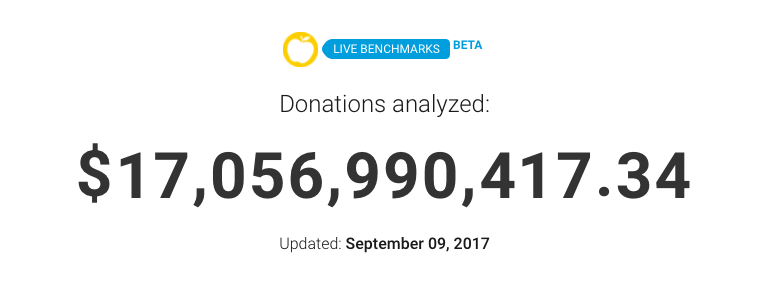
Now that it’s up, today’s post is a little less celebratory and a bit more “analytical.” While developing Live Benchmarks we analyzed a lot of fundraising data. I mean a lot. Over $17 billion in donations altogether.
While our team of engineers built the systems that run our algorithms at unbelievably high speeds, we uncovered a few surprising insights from the massive amount of data. In today’s post I’ll share a few of the most impressive takeaways we identified.

First though, it is worthwhile to put Live Benchmarks into context. Since there is nothing quite like Live Benchmarks in our sector, it is important to understand where the data is coming from, how it fits into the busy sea of existing benchmarks and reports, and plainly, what it all means. We’ll go into more detail about our methodology and technology in a separate blog post, but for our purposes here a brief explanation:
Live Benchmarks aggregates and anonymizes donation data Fundraising Report Card® users upload. That means that as more organizations use Fundraising Report Card® for their reporting and analytics, Live Benchmarks updates to reflect newly contributed data. Live Benchmarks refreshes daily to give the world a real-time pulse on charitable giving.
Now, with $17 billion in donations from over 1,600 organizations it may sound like we have a pretty good sample size, but in the grand scheme of things it’s actually quite small. Remember, there are well over 1 million nonprofit organizations in the United States alone.
Annual benchmark reports, like the one from the Fundraising Effectiveness Project, contain data from over 10,000 non-profit organizations. Blackbaud’s annual report has data from more than 50,000 organizations.
So, as you read through these insights and peruse the Live Benchmark page yourself, remember that this is actually a small sampling of the sector.
Live Benchmarks has great potential, and with more data we’ll be able to boost the statistical significance of our findings, but in the meantime we can at least identify some generalizations to start.
Okay, so with all of that in mind, onto our insights.
Key takeaways
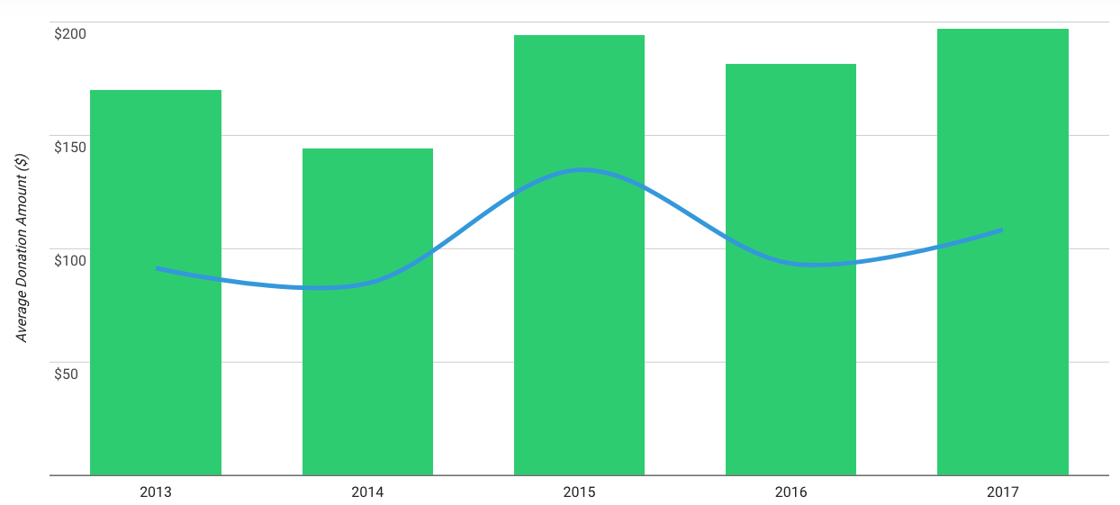
It’s worthwhile to visit the Live Benchmarks page and digest the findings for average donation amount, donor lifetime value and retention for yourself, but our team’s key takeaways actually stem from other metrics. Specifically, the percent of donors and donations that come from different segments of donor giving levels (under $100 donors vs. $100 to $250 donors for example).

If you’re keeping score at home, you can find all the numbers we are about to reference below on the Live Benchmarks page in the Giving Level section, although bare in mind they could have changed since we wrote this article.
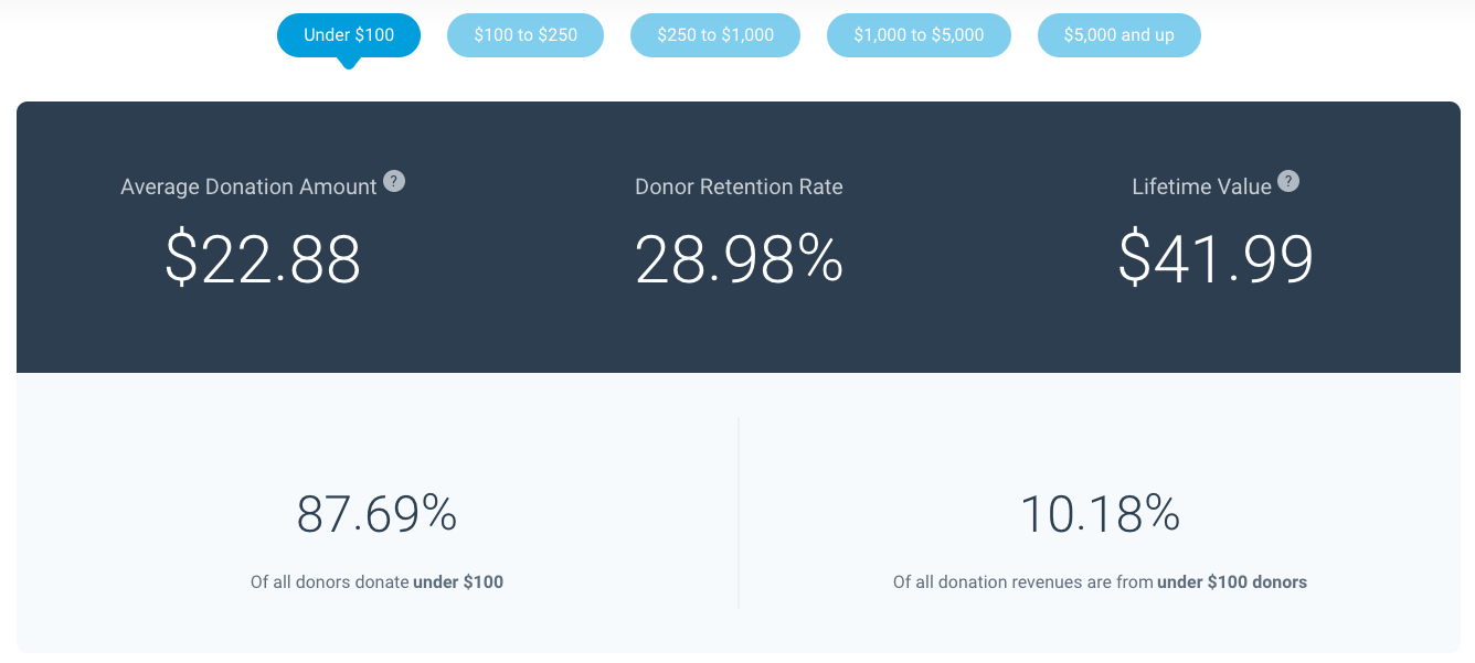
First takeaway – 87% of all donors in the past 12 months have given $100 or less. It shouldn’t come as much of a surprise that most donors make low-dollar donations, but the fact that this segment of donors represents 87% of all donors is a bit eye opening.
Even more impressive is the fact that more than 98% of all donors in the past 12 months have given $1,000 or less. If you gathered 100 donors in a room, 98 of them would donate less than $1,000 annually. Wow!
What may be even more compelling though, is how these percentages change drastically when you look at specific nonprofit industries. For example, only 51% of donors to educational organizations donated $100 or less. Remember, 87% of all donors donated $100 or less, but for nonprofits who identify as education institutions, that percentage falls all the way down to 51%.
And, whereas 98% of all donors give $1,000 or less, only 87% in the education industry fall into that same category. Interesting.
Although a small sample, Live Benchmarks presents data that helps confirm donors to education organizations give larger individual contributions than donors to other industries (or at least all industries combined).
The percentage breakdown of donation revenues is also noteworthy. We already identified that 87% of all donors donate $100 or less, but what percentage of donation revenues does that segment of donors account for? The answer is 10%. Under $100 donors account for just 10% of donation revenues to nonprofit organizations.
Again, these benchmarks look drastically different for individual industries. For instance, with educational organizations, the 51% of donors who donate under $100 to these institutions make up just .5% of all educational organization donation revenues. Recall that for all sectors, under $100 donors accounted for 10% of donation revenues, but for education organizations that plummets to one half of one percent.
What does that mean? One way to answer that question is to analyze donors at the opposite end of the giving level spectrum.
Across all sectors, .4% of donors are in the $5,000 and up segment. Yet, that small percentage of donors accounts for 70.52% of all donation revenues. Have you ever heard of the Pareto Principle, or the 80/20 rule? This is the 70/.4 rule.
Judging by the data uploaded across all non-profit industries, 70% of donation revenues are coming from .4% of all donors. We again get a very different perspective when breaking these metrics out by industry sector.
For example, in our education segment we see that $5,000 and above donors account for 3.56% of all donors, and a whopping 91.39% of all donation revenues.
Do donors to education institutions make larger donations? Live Benchmarks seems to corroborate that notion.
This exercise becomes even more fun when we begin to compare individual industries against one another. For example, religious organizations receive 42% of donation revenues from $5,000 and above donors, yet those contributors only account for .6% of all donors. Remember, for the education sector those numbers were 91% of revenues and 3% of donors.
Do donors to religious organizations make lower dollar donations? These benchmarks seem to indicate just that.
Again all of these metrics and benchmarks need to be taken within context, we simply need more data before we can say definitively that these are the facts. Yet, this data is undeniably interesting, and the best part is that it’s open to anyone and free.
There’s no fee to analyze, scrutinize or contribute to Live Benchmarks. Take a look, add your data and let us know what insights you uncover.
Happy analyzing!