
Click here to skip to our brief survey
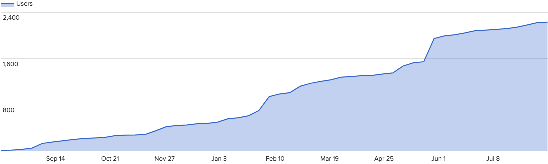
Fourteen months and two thousand nonprofits later, our team here at the Fundraising Report Card® is excited to announce that on September 1st we will be releasing our first set of industry benchmarks on fundraising metrics.
If you’re an avid reader of our blog, but aren’t sure what Fundraising Report Card® is, it is an online software that analyzes anonymous donation data and reports back key metrics, trends and board ready reports. If you haven’t already, you should check it out.
Since we launched the Fundraising Report Card® in June of 2016 over 2,000 nonprofit organizations have signed up and used the tool.

It’s an unbelievable honor and privilege to know that Fundraising Report Card® is helping so many nonprofit professionals make sense of their fundraising data. Whether it be for board presentations, strategy sessions, or identifying key segments of donors to engage with, the Fundraising Report Card® has been able to help thousands of organizations make more sense out of their donor data.
That’s awesome.
During this entire process though, we have fielded similar questions from both our users and observers. Literally a week after we launched in June of last year I was posed this question, “This is great, but how does my retention rate compare to everyone else?” For months, this exact question (substitute retention rate for average donation amount and myriad other metrics) was frequently brought to my attention.
As you know from reading this blog, fundraising metrics are useful for any savvy nonprofit professional, but most, if not all of them are more powerful when put into context.
This blog is filled with articles, tactics and strategies for analyzing historical trends in your key fundraising metrics. The context for historical analysis is time. You compare your current retention rate with last years retention rate. Comparing the two shows you if you are improving or faltering when it comes to plugging your leaky bucket.
But, historical comparison is only one of many ways to find meaning in your fundraising metrics, another is through benchmarking. “Is my leaky bucket larger or smaller than my peers?” Benchmarking is the process of evaluating by comparison with a standard.
The concept of benchmarking is not foreign to our sector, actually it is quite the opposite. Annual benchmark reports are a staple of nonprofit data analysis. Giving USA, Fundraising Effectiveness Project, The Individual Donor Benchmark Report… The list goes on and on. And, with good reason. Benchmarking your organization’s performance can help shine light on exceptional execution, or highlight areas where you need to improve.
Here at Fundraising Report Card® we acknowledge and comprehend how powerful benchmark comparison is. That’s why we have spent the past few months developing systems to create benchmarks of our own. With over $15 billion in donations analyzed from over 2,000 nonprofits, we thought now was as good a time as ever to start.
We decided that instead of adding to the already cluttered landscape of annual benchmark reports, we would approach the situation a bit differently. Our team of engineers has spent many weeks creating the infrastructure to generate Live Benchmarks.
These benchmarks will update daily and be available on this page starting on September 1st: fundraisingreportcard.com/benchmarks
Unlike your static annual report, or pdf booklet, Live Benchmarks as we are calling it, will be a webpage you (or anyone you share it with, please share it!) can visit to get a pulse for how fundraising metrics are ebbing and flowing. Interested in what the average donation size amongst $1,000-$5,000 donors is right now, at this very minute? Great, check out Live Benchmarks it has the answer.
Soon, and depending on the feedback we receive, we will be releasing segmented Live Benchmarks. Starting on September 1st, Live Benchmarks will include only aggregate data (benchmarks calculated from all $15 billion in donations we have), but in the near future you’ll be able to segment your benchmarks based off of organization sector and organization size. Essentially, you’ll be able to answer the question, “What is the average retention rate for annual fund donors for environmental organizations?” You’ll be able to take that and compare it to yourself.
Pretty powerful stuff.
Plus, you can easily compare yourself and contribute to Live Benchmarks. Simply sign up for a free Fundraising Report Card® account, upload your anonymous donation data and compare yourself to the ever growing Live Benchmark values.
It’s our hope that this accessibility to data and metrics can be transformative for nonprofit professionals and further the data-driven discussion internally at your organization.
But, all of this is about two weeks away! So what metrics do you have to look forward to on September 1st? Take a look at our list.
Giving Level Metrics
These metrics will be broken down into giving level segments. Those segments are: Under $100 donors, $100 to $250, $250 to $1,000, $1,000 to $5,000, $5,000+. And will be calculated for the following metrics:
- Average donation amount
- “The average donation amount from an under $100 donor is ____”
- Lifetime value
- “The expected lifetime value of an under $100 donor is ____”
- Donor retention rate
- “Under $100 donors are retained at __%”
Retention Metrics
These metrics will not be segmented, but rather on aggregate across all giving level segments.
- First-time donor retention rate
- Repeat donor retention rate
- Reactivated donor retention rate
- Donation retention rate
General Metrics
Again, these metrics will not be segmented, but on aggregate.
- Gift frequency
- “The average nonprofit receives 1.6 donations from a donor during the year”
- Most frequent donation amount
- “The most common donation amount for a nonprofit is $20”
And, we’ve already calculated a few of the actual benchmark numbers. For example the percentage of donations and donors from each giving level.
For 2016
- 92.3% of all donors gave under $100
- 5.5% of all donors gave $100 to $250
- 1.4% of all donors gave $250 to $1000
- .5% of all donors gave $1000 to $5000
- .2% of all donors gave $5000+
- 15.9% of all donation revenue came from under $100 donors
- 4.9% of all donation revenue came from $100 to $250 donors
- 4.4% of all donation revenue came from $250 to $1000 donors
- 7.2% of all donation revenue came from $1000 to $5000 donors
- 67.5% of all donation revenue came from $5000+ donors
Hopefully these benchmark metrics have you as excited as we are! But, I hope you don’t mind us asking for some of your help as well.
We want Live Benchmarks to be a collaborative and community driven initiative. Below is a brief (I mean really brief) survey. If you can, please fill it out and share with a colleague or two.
Your input is hugely important and will shape the way Live Benchmarks grows and adapts.