Two Easy Ways to Make Your Donor Data “actionable” (in less than 30 minutes and for free)
Greg Warner
By now you may have read a few articles on the importance of “leveraging your donor data” or about how you should “make your data actionable.” I’m one to talk. I write about both of those subjects here on the Fundraising Report Card® blog frequently.
The idea of “making your data speak” can, at times become overwhelming. There is a good bit of math involved in many of my articles and occasionally the topics become complex.
Doing an in-depth analysis on your donor data is compelling. There is no doubting that. Large universities employ whole departments and teams dedicated to researching, mining and making sense of their donor data.
It’s obvious that doing in-depth data analysis is worthwhile, but it can be daunting. If you’re a small team or strapped for time, it can be hard to justify spending hours (or even days) trying to do some convoluted calculation on donor lifetime value.
I get it.
But, if you have your donor data in a CRM or database you are only a few steps away from getting in-depth insights about your constituents. Even if you store your data in accounting software like Quickbooks, it can be pretty easy.
There are whole lot of numbers, metrics and reports you can calculate from your database. But sometimes it helps to take a step back and look at the big picture.
This article will focus on 2 super simple ways you can “leverage” your data. Both techniques take less than 30 minutes to complete, I promise.
First, we’ll go over how you can quickly and seamlessly transform your spreadsheets of donor data into easy-to-read charts and graphs that your board will love. And second, we’ll go over a few easy ways to segment your data for targeted appeals and campaigns. Both are pretty easy, and neither one will take up a whole day to complete.
People like to Look at Things
I don’t know about you, but I’m not very good at reading through a big Excel spreadsheet. Chances are your board members aren’t that great at doing it either. That’s not to say that the information on those spreadsheets isn’t compelling (it is), it’s simply difficult to comprehend.
When you have your quarterly or annual board meeting it is imperative to get through a lot of material in an efficient manner. I’m no board meeting guru (more on that here), but I understand the basics; keep board members engaged, don’t waste time.
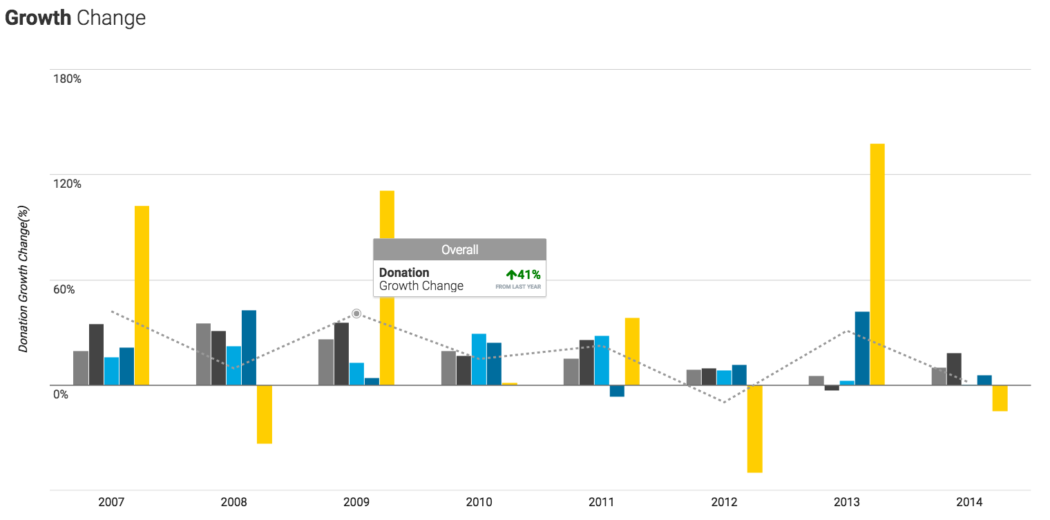
One easy way to do that is to share visual reports of key fundraising effectiveness metrics. In the past you may have sent out a Word doc, or Excel spreadsheet showing revenue growth to the board. But now with advances in technology, you can keep everyone engaged with visual representations of your progress.
Okay, so now the big question. “This all sounds nice, but how can I make nice charts and graphs in less than 30 minutes?”
I’m glad you asked.
Use the free Fundraising Report Card®. Don’t pay for the Pro version, just use the free “Core” tool.
There you go, visual reports on donation and donor growth. There are more charts and reports that you can share with your board, but if you are just looking for the basics simply stop there.
If your CRM integrates with the Fundraising Report Card® it takes less than 60 seconds to generate your donor and donation growth reports. Assume you spend 10 minutes customizing your report, and maybe 5 minutes finicking with the print settings. By the time it is all said and done, you’ll have your customized reports in well under 30 minutes.
Your data just became “actionable.” Not so bad right?
Segment Your Donors for Data-driven Appeals
Now that we have some visualizations that your board will love, it is time to move on to strategy.
Coming up with a strategic plan takes weeks, not minutes. But, with your donor data stored in a CRM or database you are able to move more rapidly than you have in the past.
Segmenting your donors is a great way to become more targeted and “data-driven” in your approach to fundraising. You have invested in organizing your data–now you are in a position to leverage that information.
Imagine being able to send a direct mail piece to all donors who lapsed from your organization last year. And then a separate direct mail piece to all your retained donors. The lapsed donor appeal letter would ask for the donor to reactivate and come back to the organization. The retained donor appeal would ask for an upgrade. Simple, right?
Take it one step further. Segment your retained donor appeal by giving level. Imagine sending an email appeal to donors who have made gifts under $100, and a separate email campaign to those who have made gifts totaling $100-$500, and finally, a separate campaign to those who have made gifts of $1,000 or more. In each email you could have the same body copy and simply change the ask language in each email.
No more “throw it against a wall and see if it sticks” approach. Segment, target and customize appeals for different donor levels and donor types. This will help maximize response and increase revenues.
Just like above, with visualization, this sounds nice, but how easy is it to implement? Since you’ve organized your data in a CRM you are one step ahead of your peers. And again, you can take advantage of the Fundraising Report Card®.
Upload your data, go to your Retained Donor Report, click on a segment and choose, “export data.” You’ll get a list of Donor IDs that correspond with that segment of the report. Take those back to your CRM and voila, you have your segmented appeal list.
This will take no more than 30 minutes and will pay off dividends in the long run. The most time consuming aspect of targeted appeals will most likely be getting approval from the marketing department to send out the email.
Bringing It Together
So that’s it. Nothing too scientific. Nothing too “geeky.” Pretty straightforward stuff. You’ve already invested thousands of dollars in housing, organizing and maintaining your donor data. Now it is time to leverage all that hard work. Hopefully these 2 simple ways will help.