What would you do with $40B? If you’re Warren Buffett you might donate it all to charity. If you’re anything like me, you’ll analyze it.
This past week at Fundraising Report Card we surpassed $40B in donations analyzed by our FREE analytics tool. Even I had to pause for a moment and say “Wow, that’s a lot!” This data is accessible to anyone on our Live Benchmarks page.
As a brief reminder, Live Benchmarks updates every single night to calculate updated fundraising benchmarks. The data comes from anonymous donation data loaded into Fundraising Report Card. We’re democratizing data and benchmarking, and if you want to contribute, you can by uploading your anonymous donation data here.
What you can learn from $40B in donations
After hitting this milestone, I decided to dig into the numbers. Yes, we have access to a lot of data, and yes, the Live Benchmarks page does a pretty good job showcasing it, but it still can be overwhelming.
Here are three key takeaways I found when reviewing the numbers:
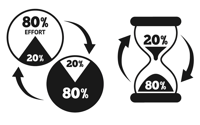
The 80/20 rule in action
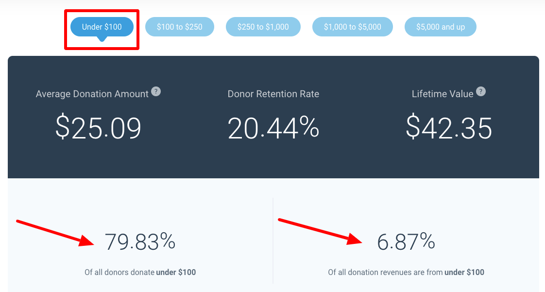
Fundraising Report Card benchmark data shows 79.83% of all donors gave $100 or less in calendar year 2018. That cohort of donors contributed 6.87% of total donation revenues.
The Pareto Principle suggests that 80% of an output will come from 20% of the input. This principle transcends all aspects of life, and in fundraising, it’s no exception.
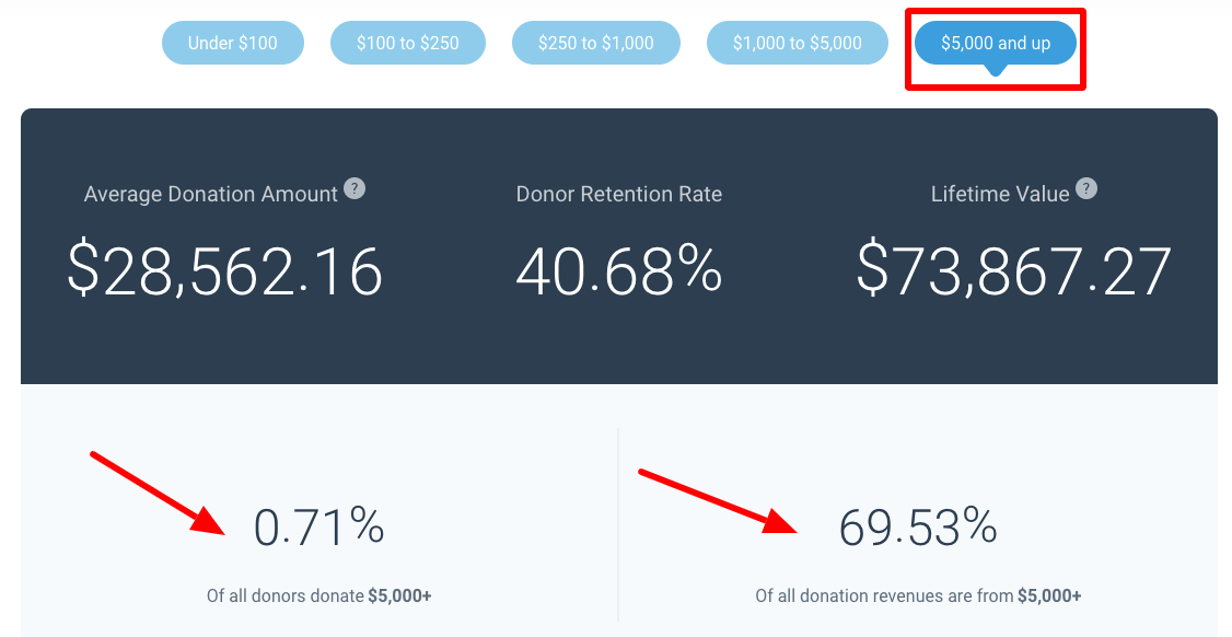
When we look at the benchmark data for the opposite cohort (large dollar donors, which Live Benchmark’s defines at $5,000 or more in giving), we see the principle hold true. In 2018, less than 1% of all donors, .71%, gave $5,000 or more. However, that small subset of supporters contributed ~70% of donation revenues (69.53%).
The 80/20 rules suggests that there will be an 80/20 distribution of outputs from inputs. We can see here, from Live Benchmarks, that we’re actually experiencing an even more exaggerated distribution.
Remember, you can analyze Live Benchmark’s by specific sector. Head over to the page, click the dropdown labeled “sectors,” and look at the distribution amongst those as well. It’s pretty incredible to see!
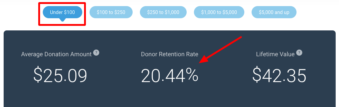
Donor retention rate dichotomy
Nearly five years ago when I started my career in the nonprofit space, I listened to thought leaders preach the importance of donor retention. Their message still resonates, and the importance of building relationships with supporters is still of the utmost priority for all development offices.
When reviewing Live Benchmark’s retention data by giving level we identify a dichotomy. Small dollar donors are retained at ~20% year over year, while large dollar donors are retained at ~40%.
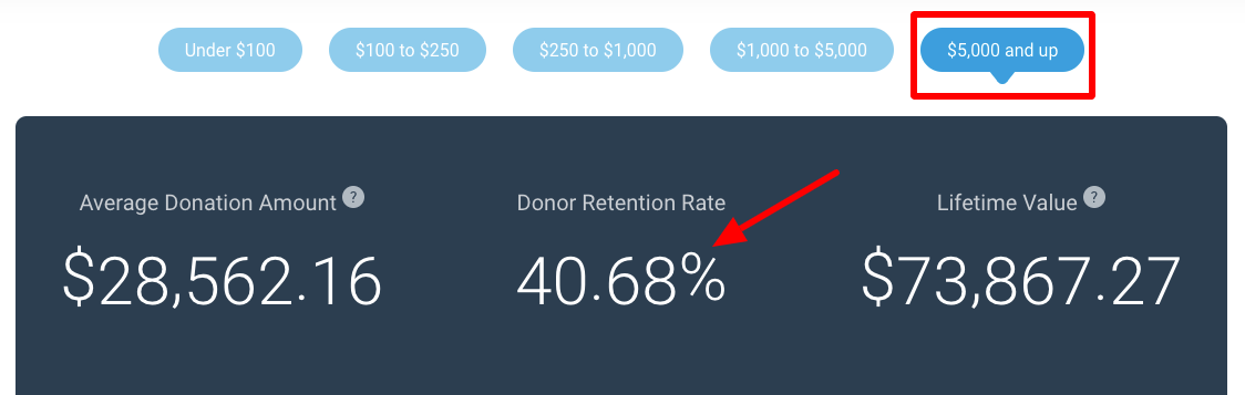
Why the gap? Strategy, tactics, and execution. As I’ve written about in the past, retaining donors is not easy. If you are going to focus your attention on retaining any one subset or cohort, focusing on major donors makes sense. The data shows the unintended outcome of that focus.
Health and Religion struggle to retain
Our Live Benchmark page is not that in depth… There is a lot of data, but the “slicing and dicing” we can provide is very limited. This all goes back to the data being anonymous. However, we can provide segmentation of benchmarks by sector.
When you look at retention rates for Health and Religious organizations you start to notice an undeniable trend — their below normal. Health organizations retain ~15% of their under $100 donors year over year. Religious organizations don’t fare too much better at ~16%.
Segmenting benchmarks by sector can provide more clarity and commentary when you pair them with your organization’s key performance metrics.
More benchmarking opportunities
If you’re anything like me, and you find this type of data exhilarating, you’ll be excited to know that there are other benchmarking opportunities for you to be a part of. Yes, there are annual (and now quarterly) benchmark reports from AFP, BlackBaud, and the sort, but smaller firms are entering the space. The team over at NextAfter is conducting interesting benchmark research right now that you can be a part of.
NextAfter is most concerned with online fundraising benchmarks. What we’ve been reviewing above is not segmented by giving channel (print, digital, etc.), but NextAfter’s benchmark research is. The three key metrics they’re measuring are:
- Web Traffic
- Donation Conversion Rate
- Average Gift Size
You can contribute to their benchmark report by clicking on this link.
Applying this at your shop
I’ve said it before, and I’ll say it again… Benchmark against yourself first, then against your peers. “How do we compare to the other youth sports non profit in our region?” A board member may ask. Replying with, “I’m not sure, but our year over year retention rate has increased by 12%,” is the appropriate answer.
Peer to peer benchmarking should only take place after historical benchmarking.
However, if you’ve done that already, or if you truly are interested, refer to Live Benchmarks, contribute in NextAfter’s research, and maybe even add a Google Search alert for the phrase “fundraising benchmarks.”