Fundraising Metrics 101
Part 2 of 6 in Our Data-Driven Fundraiser’s Reference Guide
On this page
Too much data, too little time
Why measure metrics?
9 key fundraising metrics
Using these metrics to answer questions
Presenting to colleagues, staff, and the Board
Applying this to your shop
Key takeaways
Too much data, too little time
In part 1 of our Data-Driven Fundraiser’s Reference Guide, we talked about the beginning steps for becoming more data-driven. We touched on organizational culture, infrastructure and a few basic “evidence-based” questions to answer. This week we are going to dive more into the “meat and potatoes.”
But first, a short story.
When I first started developing the Fundraising Report Card®, I was lost. I distinctly remember one afternoon googling “fundraising metrics” and being completely overwhelmed. I had stumbled upon the AFP FEP Glossary of Terms. That document was humbling. It contains 68 different fundraising metrics and 21 separate ways to calculate retention. It’s eye opening to say the least.
Want to know more of the backstory of Fundraising Report Card®? Read more about how we got started here!
As I read through the pages, I remember saying to myself, “There’s no way we can do this, there is just too much stuff, too much to calculate.” I had hoped to build something that would help fundraisers get access to their key metrics in a few seconds, not a few hours. Realizing then that there were 68 “key” fundraising metrics made me think it was impossible to build something quick enough, and simple enough, to be user-friendly. I felt defeated.
Fortunately, I work with some great people. I shared the AFP FEP Glossary of Terms with them and they helped me pare it down. It’s not that every metric in the document isn’t useful. They are. It is just that some have applications outside the scope of most nonprofits. I had overlooked that.
Fundraising metrics are great, they help us answer our questions and guide strategy. But too many metrics and not the right ones simply become noise. They cloud our vision and actually get in the way.
If I felt defeated looking at the full AFP FEP Glossary of Terms, I can only imagine a nonprofit pro might feel the same way. That’s why today, in part two of our six-part series, Data-Driven Fundraiser’s Reference Guide, we will discuss the true key metrics that your organization will want to have on stand-by.
Why measure metrics?
Before we dive in too deeply, let’s regroup on a key concept from part 1 of the series. Why measure metrics? As you’ll recall in part 1 we defined data-driven fundraising as simply fundraising that is compelled by data, not intuition or gut-feel .
With that in mind, we’ll want to have a few different metrics already calculated for when questions arise and answers are needed. You could run your calculations on an ad-hoc basis. One day you may be posed with the question, “Would a welcome email series increase donor retention?” How will you be able to come up with the answer? You’ll need to calculate current donor retention at this moment, and then again after you test your hypothesis.
But, if you had the infrastructure in place and already had donor retention being calculated for you (software automation), you could simply move onto the strategy component — creating the welcome series. You don’t want to get caught up in the eye of the storm. Imagine calculating a dozen metrics in Excel (pivot tables and all), and then immediately trying to interpret them. It would be difficult to say the least. Your mind wouldn’t be as sharp as it could have been if those metrics had already been calculated, and were already there, waiting for you.
Remember, metrics are part of the evidence-based practice we discussed in part 1. They are the measuring stick you will use to validate or dismiss your hypothesis. As you test things you will use different metrics to measure their effects.
Get Data-Driven Fundraiser Email Updates
9 key fundraising metrics
Here are 9 key metrics, not 68, that I would keep tabs on. These will be useful when questions do arise, and in my experience they are some of the most helpful numbers on which to concentrate your efforts.
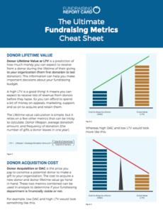
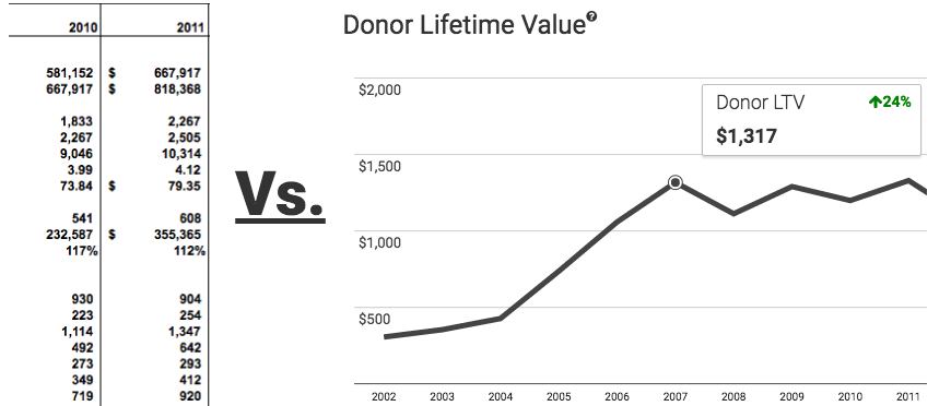
Donor Lifetime Value

Donor Lifetime Value, or LTV, is a prediction of how much money you can expect to receive from a donor during the lifetime of their giving to your organization (from first donation to last donation, acquisition to lapse). This information can help you make important decisions about your fundraising budget.
Keep in mind that a high LTV is a good thing! It means you can expect to receive lots of revenue from your donors before they lapse. That means you can afford to spend a bit of money on appeals, campaigns, support, and so on to acquire and retain them.
The Lifetime value calculation is relatively simple, but it relies on a few other metrics that can be tricky to calculate. To calculate your LTV you’ll need to know your donor lifespan, average donation amount, and frequency of donation (the number of gifts a donor leaves in one year).
In the end the calculation looks something like this:
LTV = Lifespan × Average donation amount × (Total # of donations ÷ Total # of donors)
We will go much more in depth on lifetime value in part 4 of this series, titled “Measuring ROI with Donor Lifetime Value.”
Donor Acquisition Cost
Donor Acquisition, or DAC, is the price you pay to convince a potential donor to make a gift to your organization. The cost to acquire a new donor and donor lifetime value go hand in hand. These two metrics combined can be used in analysis to determine if your fundraising department is financially viable or not. We will cover this in much more depth in part 3 of the series, “Diving in with Donor Acquisition Cost.”
To calculate your DAC you will want to include all expenses associated with your fundraising activities. This can include expenses to third party vendors, postage, staff salaries and other fundraising related costs.
Ultimately your donor acquisition cost formula will simply be:
DAC = Total costs ÷ Total # of acquired donors
You’ll interpret your DAC in a cost per donor context, i.e. “It cost us $25 to acquire each new donor from last month’s direct mail appeal.”
Donor Retention Rate
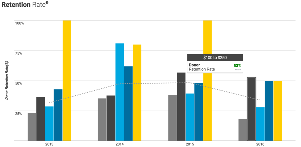
Simply put, donor retention rate is the number of donors you keep with respect to the number you had at the start of a given period of time. This does not count new donors, but it will included upgraded and downgraded donors.
To calculate donor retention rate you’ll take all retained donors in a year and divide that by all donors from that year.
This equation is pretty simple, and I’m sure you’ve seen it covered on many other fundraising blogs and websites:
Donor Retention Rate = (Retained Donors ÷ All Donors) x 100
Donation Retention Rate
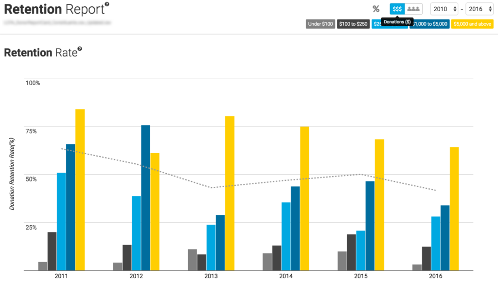
Donation Retention Rate is basically revenue renewal values – the dollars that renew – and is generally measured on an annual and/or cohort basis (think by appeal segment, or donor type). The important point here is that Donation Retention Rate focuses only on the money, the actual revenue you retain, rather than donors.
So if your existing donors start giving more through upgrades, your Donation Retention Rate might grow even if you’ve lost some donors. You’ll generally want to have both donor and donation retention rates on hand for all your specific giving segments. That way you can monitor upgrades and downgrades as well as lapses and overall retention.
Again, this formula is pretty simple:
Donation Retention Rate = (Retained Donations ÷ All Donations) x 100
Upgrade & Downgrade
An upgraded donor is a retained donor who gave more this year than last year.
A downgraded donor is a retained donor who gave less this year than last year.
These two segments of donors have an outsize impact on donation retention rates.
Lapsed Donors
We aren’t the only ones preaching the importance of fundraising metrics! Claire Axelrad was on to this 6 years ago! Check out her blog post from 2011, Is Your Data Actionable?.
Lapsed donors are donors from last year who did not give again this year to your organization.
Lapsed is also frequently referred to as attrition or LYBUNT (last year but unfortunately not this). You’ll need to keep tabs on how this number is fluctuating during the calendar and fiscal year, and then of course, at year end for comparison.
Reactivated Donors
A reactivated donor is an individual who previously lapsed, but gave again this year to your organization. Tracking and measuring reactivation rates can help you quantify the effectiveness of your recapture strategy.
Churn
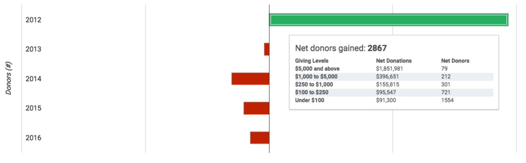
Churn is a measure of the velocity at which donations or donors are growing (or contracting) each year. Churn looks at your acquired donors/donations and lapsed donors/donations in a particular year and calculates your net gain or loss for that period. It answers the question, “Are we bringing in more new donors than we are lapsing existing ones?”
This can be an eye opening metric for organizations that may have top line revenue growth but are actually shrinking. They may be growing donations, but they are not acquiring enough donors to overcome those who leave. It can be a telling sign that the organization needs to change strategy.
Using these metrics to answer questions
The 9 metrics outlined above are worthwhile to keep in mind, but in all honesty, they are kind of useless without context. Most people aren’t interested in looking at numbers and data , but they are interested in having pertinent information at their fingertips. Fundraising leadership, now more than ever, needs and relies on relevant data to help make strategic decisions. By keeping track of these key metrics you will help enable that.
Remember, the 9 key fundraising metrics outlined above (and available in our handy PDF cheat sheet) are meant to be metrics you should have on stand-by. As your organization buys into the idea of being more data-driven you will want to be able to quickly and seamlessly answer their questions. “Jane, did our recent appeal end up increasing or decreasing our total number of upgraded donors?” Someone will ask you that and you’ll want to have that information available in seconds, not hours or days .
With that in mind, double check the reports that your CRM provides for you. Have you already created some Excel spreadsheets that will calculate some of those metrics? You might be surprised at what you find. Secondly, think about how you can share this information with your colleagues. Will a spreadsheet make sense to your direct report, or do you think she would prefer a graph?
Actually, let’s dive deeper into that subject because all of these calculations and reporting are useless if no one uses them…
Presenting to colleagues, staff, and the Board
The final piece of the pie is presentation. Computers are great at reading spreadsheets. Humans, not so much. As you question, test and measure results, you’ll want compelling ways to share what you are learning with colleagues and the Board. The key here is data visualization. Well done data visualization is data simplification .
“There’s a big reason that people use the phrase, ‘A picture is worth a thousand words.‘
As Bill Franks, Chief Analytics Officer at Teradata and a Faculty Member at the Institute for Analytics reinforces, our brains are meant to see in pictures. He uses a really powerful example to illustrate this-a map of the United States. The Fundraising Report Card® makes organizational fundraising data into graphs where intelligent design and unhabitual thinking can occur!
Think about it. A map is one of the most powerful visualization tools ever created! It shows relationships, relativity, and much more. The FRC is a map to past results which allow an opening to occur. With clients, the information provided by the FRC allows organizations culturally to adopt the act or ask strategy.
Like a map where you can immediately see the size of states, contiguous states, what state is part of what region, etc., the FRC lays out all the important focus points to redesign to achieve different funding results.
A current client said to me, ‘I feel like you have given me a gift certificate to Home Depot. The information from the FRC allows me access to power tools that focus my organization and most importantly, have different conversations with my board and fundraising staff to achieve quantum results.’”
Anyone can tell if a donor lifetime value (LTV) chart is going up and to the right. If it is, that is good. If it isn’t, that is bad. Most of your colleagues and your Board will not be as interested in underlying reasons why LTV is changing for better or for worse. They simply want to know (from a high level) what is going on. Visualization can help in this quest.
You will almost certainly get posed with (or ask yourself) the question, “Has retention gone up or down this year?” You could impress your coworkers and direct report with an Excel pivot table spreadsheet that breaks down each giving segment and shows not only donor, but donation retention as well. Or, you could leverage some existing (and free) technology to help visualize that information. (P.S. that’s what we’ve spent the past year building here for you to use for free.)
Time sensitive colleagues will be hesitant to dive into your Excel masterpiece, but if you present to them a simplified, visual representation of that data they will be more likely to buy in. Remember, well done data visualization is data simplification. Don’t just create a bar graph for the sake of creating a bar graph. Put some thought into it, or leverage existing tools to create data visualizations that make sense.
Applying this to your shop
We’ve talked a lot about why fundraising metrics are necessary to calculate and have on stand-by, and we’ve even pared down the AFP FEP Glossary of Terms from 68 metrics to 9. So what is next? How do you actually use this information?
Jennifer Filla offers up great advice for getting started with data analysis in her blog post, Getting Started in Data Mining (It’s easier then you think!).
In parts 3, 4 and 5 of this series we will get into more detail for three of these key metrics (DAC, LTC, and Retention), but in the meantime, today is the day to start organizing your infrastructure.
Take a peek at what reporting your existing CRM has. Can it produce spreadsheets on retained and upgraded donors? If the answer is yes, you’re off to a good start. Did you create and Excel spreadsheet a few months back that keeps track of recaptured donor rate? Great! Dig that up and dust it off.
Please do keep in mind though that the free version of Fundraising Report Card® will calculate most all of these metrics for you automatically. That doesn’t mean you need to use it, but it is available to you for free.
Remember, this is part 2 of 6 in our Data-Driven Fundraiser’s Reference Guide! If you’re interested in receiving email updates as new parts of the series are released, please fill out this short form:
Get Data-Driven Fundraiser Email Updates
Key takeaways
- Fundraising metrics are great, they help us answer our questions and guide strategy. But too many metrics and not the right ones simply become noise. They cloud our vision and actually get in the way.
- As your organization buys into the idea of being more data-driven you will want to be able to quickly and seamlessly answer their questions. “Jane, did our recent appeal end up increasing or decreasing our total number of upgraded donors?” Someone will ask you that, and you’ll want to have that information available in seconds, not hours or days.
- As you question, test and measure results, you’ll want compelling ways to share what you are learning with colleagues and the Board. The key here is data visualization. Well done data visualization is data simplification.
NOTE: Thank you Claire Axelrad, Sophie Penney, Jennifer Filla and T.J. McGovern for sharing your insights and feedback on this section of the guide. Thank you Jennifer Willett, Cheryl Papsch and Lizzie Weiland for editing this section of the guide.
Take me to part 1Take me to part 3