
What would you do with $20,447,633,199.37? Fund a new program? Hire more staff? Buy that new database software you desperately need?
Our team here at Fundraising Report Card® has $20,447,633,199.37 and we decided not to buy anything with it. Instead, we wrote some complex algorithms and made a free website to talk about nonprofit fundraising metrics. (Oh, and we did upgrade our database too).
Live Benchmarks, a project launched by our team late last year was the culmination of months of work. Everyday we analyze billions of dollars in donations to determine where our sector stands with regards to a variety of metrics (average donation amount, retention rate, etc.).
If you’re interested in learning more about where we get the data, how we crunch the numbers, and how you can get involved, click here.
Today, after we have firmly entered the new year, it’s as good a time as ever to review where Live Benchmarks stands. And, more importantly, where your organization is positioned relative to them.
Average donation amounts
Average donation amounts have historically been used as a benchmark metric for fundraising departments. It’s relatively easy to calculate, simple to comprehend, and, on the surface, a fair indicator of giving behavior (are donors giving more, or less?).
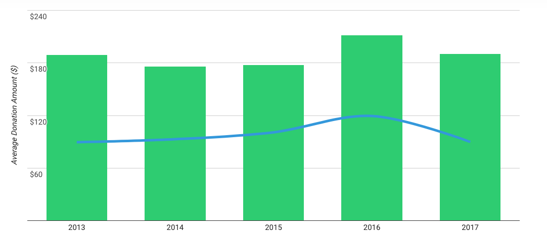
Live Benchmarks shows us that for 2017 (we have data for 2018, but it’s too early to tell anything conclusive) average donation amounts went down. After a 5 year peak at $212 in 2016, average donation amounts fell around 10% to $190.35 in 2017.

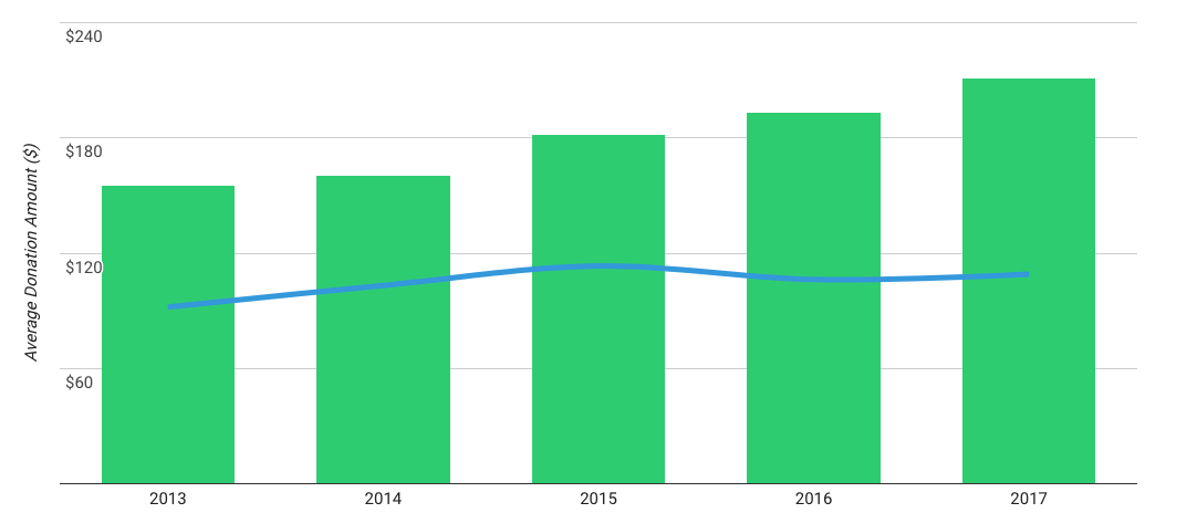
What is more interesting is how average donation amounts have ebbed and flowed for specific sectors. Take for example the “religious” sector. Average donation amounts have been climbing steadily for the past 5 years, with a peak in 2017 at $211.09.
Why have religious sector donations amounts increase at around 10%, while overall average donation amounts have decreased by the same amount? That’s a question that goes above my pay grade, but it may have something to do with our increasingly terse political climate.
What about for your organization? What sector are you a part of? How does your average donation amount trend compare to the Live Benchmark? Benchmarking is an important component of strategy, and it’s my hope that with our free resource you’ll be able to do that more easily and effectively this year.
Donor retention rates by giving level
In our sector when we aren’t talking about donations we’re almost certainly talking about donors. And when we’re talking about donors we’re almost always either talking about acquiring more, or retaining the ones we already have.
Donor retention rate, the measure of how effectively we are developing relationships with our donors, is seemingly always in the news. On the Live Benchmarks page you can quickly toggle between donor retention rate metrics for different “giving levels.” Giving levels pertain to donors who give certain amounts with any year.
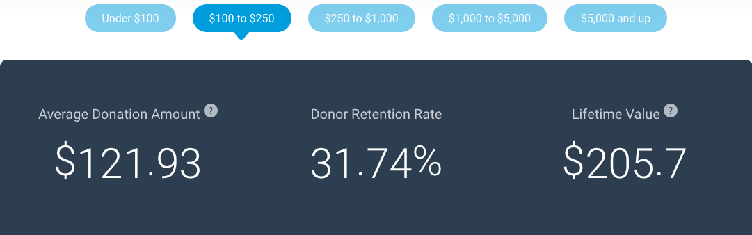
For example, you can see that for $100 to $250 donors in 2017 their donor retention rate is 31.74%. That means, as a sector, if 100 donors made between $100 and $250 in contributions to your organization last year, you would only expect 31 of those people to renew again this year.
How does this differ for larger dollar donors? Let’s see…
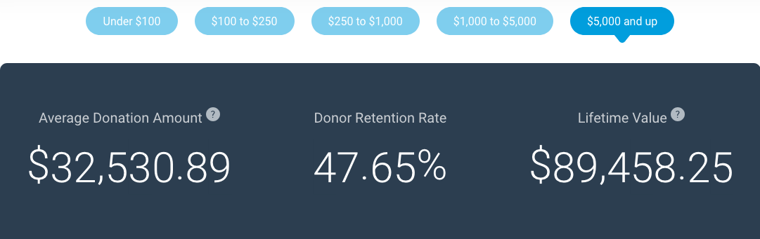
$5,000+ donors had a 2017 retention rate of 47.65%. Much higher than our other segment. Where does your organization stand relative to these Live Benchmarks? If you’re doing much better (especially when broken down by your specific segment), then share this with the board. If you aren’t then use the data to help drive a discussion internally regarding how you can address it.
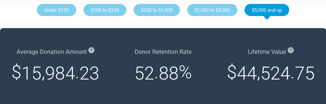
And, again, remember you can break down these benchmarks by sector. For “religious” organizations we can see that $5,000+ donor retention rate is even higher than the overall benchmark at 52.88%.
Donor distribution by giving level
One unsung hero of data-driven analysis is “donor distribution.” Or, as I like to phrase it, “how top heavy is the organization?”
Relying on too few major donors can be a recipe for disaster. Relying on too many annual fund donors and not having major donors can cause anxiety too. Finding the “right” distribution for your donors (think among giving levels, you want the right mix of small dollar, mid-level and major donors) is crucial for building a sustainable development program.
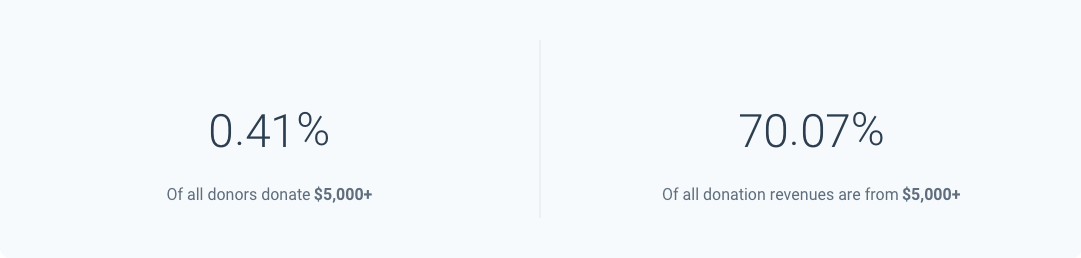
For the $5,000+ giving level segment we can see that our donor distribution is a bit alarming. This is not sector specific, but rather across all organizations, our entire $20 billion data set. You can see that for 2017, .41% of donors were in the $5,000 and up giving level. Yet, that small subset of funders contributed a whopping 70.07% of donation revenues in 2017. Wow! That’s top heavy.
What about the other end of the spectrum, small dollar donors?
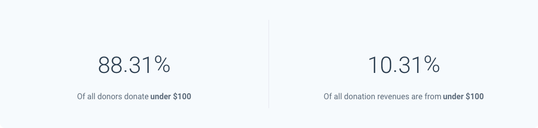
Live Benchmarks shows that 88.31% of all donors in 2017 donated $100 or less. But, of that large group of funders, they only accounted for 10.31% of donation revenue. That’s a lot of people to engage with to only raise 10% of revenues!
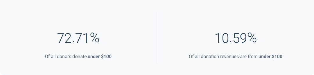
Let’s look at this for the religious sector once more. Under $100 donors to the religious sector accounts for a bit less than the 88.31% industry average. Instead, you can see that when it comes to religious organizations, 72.71% of their donors are in the under $100 giving level, and 10.59% of their total revenues stem from this group.
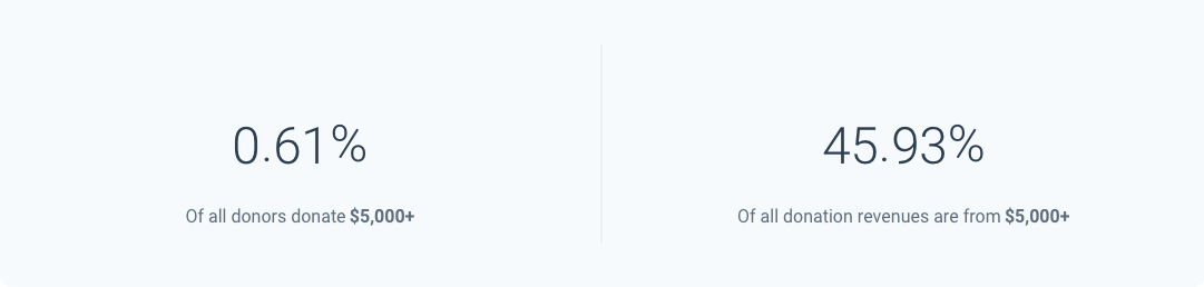
What about for major donors? Unlike the industry wide distribution, the religious sector specific benchmark is far less top heavy. For 2017, $5,000+ donors accounted for .61% of all donors. Their giving totaled 45.93% of all donations, far less than the 70.07% we discussed earlier.
How does your organization compare? Are you too reliant on a handful of major donors? Do you have a strong pipeline of mid-level donors that need to be upgraded? Or, are you all annual fund? Upload your data to Fundraising Report Card® and see in seconds. Plus, you’ll be able to seamlessly compare your metrics to Live Benchmarks, for free.
Applying this at your shop
How do you take this information and make it actionable at your organization? That’s a great question. There are two key “next steps” you should have:
- Get your metrics. Before you benchmark your organization to others, you need to have your metrics in hand. Use Fundraising Report Card®, use Excel, use whatever. Simply take the time to get your data organized, analyzed and prepared before you begin benchmarking.
- Have a discussion. If your metrics are strong relative to peer organizations, that’s great. Do you know why your average donation amounts, donor retention and donor distribution are fairing so strongly? That’s the discussion you need to have internally. Let data (i.e. your metrics and how they compare to Live Benchmarks) help frame a conversation internally at your organization.


One thought on “New Year, New Benchmarks: How Does Your Organization Stack Up?”